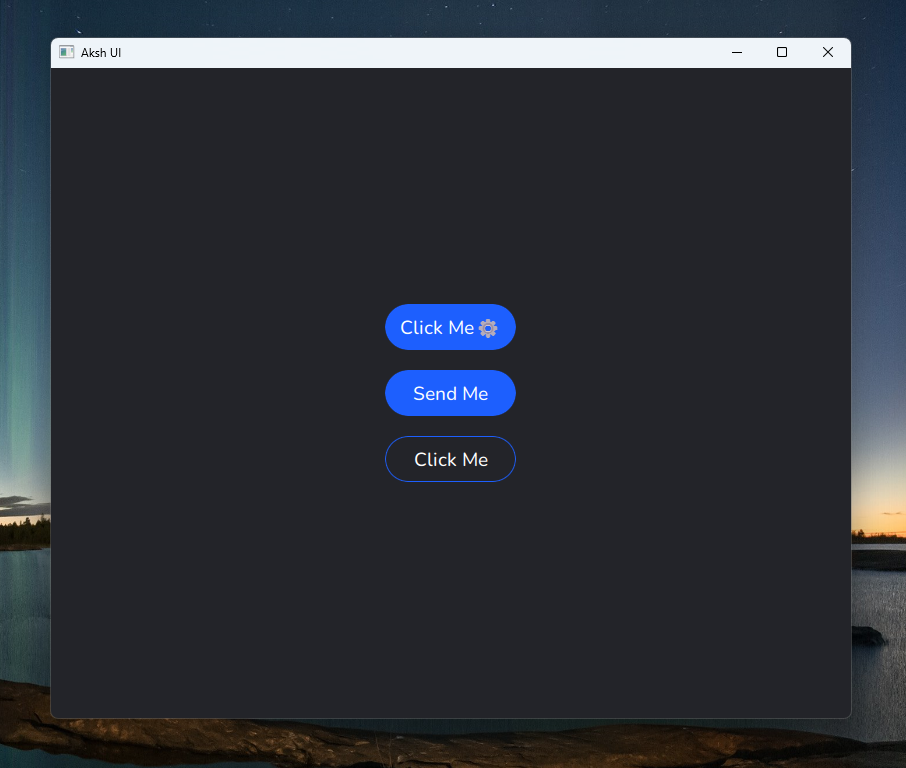
Advanced QML Button Component
This QML component defines a sophisticated customized button with several advanced functionalities:
The setIcon property allows adding an icon to the button. This is shown on the right side using a Label element within the RowLayout contentItem.
The isDefault property changes the button color to a default color when true. This provides a visual indication of the primary button.
The style property allows setting the overall style, referring to a style sheet. This provides flexibility to change the styling of all buttons at once.
The background Rectangle uses opacity masking to achieve rounded corners. The mask Rectangle defines the mask shape, and the OpacityMask applies it to the background.
Animated properties:
The background color uses a ColorAnimation to smoothly change when the style changes.
The content label's scale animates when the button is pressed, providing a subtle pressed effect.
Hover effect:
The MouseArea listens for hover events, changing the cursor shape for visual feedback.
Press effect:
When pressed, the animation is started to show the highlight indicator. The mouse position is captured to position the indicator correctly.
The highlight indicator Rectangle:
Grows and fades out when the animation is started
Uses a lighter color derived from the style to provide visual contrast
Overall this custom Button component provides:
- Flexible styling options
- Icon support
- Animated color changes
- Hover cursor
- Press highlight indicator
- Animated pressed effect
The use of properties, animations and opacity masking give this Button more advanced functionality beyond the basic Qt Button. Let me know if you have any other questions!


